Almost the final version of the double page spread, the written article for the double page spread I made for Niles, I've tried to portray him as an alternative artist as best as I could.
Saturday, 25 March 2017
Friday, 24 March 2017
Double Page Spread Update
I have decided to change what sort of style I'd prefer for my double page spread, after looking at conventions and style models for punk/alternative magazines I think something similar to this works better - with the title or an attention grabbing quote going over to the other side of the page. I feel like this would work better as it'd look more appealing to readers.
Monday, 20 March 2017
Double Page Spread Photoshoot
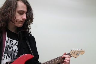
These are just some of the images I've taken of my subject for the double page spread, I'd taken many more and tried to experiment with a faceless image idea I had. But ultimately I decided against using this idea.
Contents Page Alteration
This is the more dated version of the contents page now as I have changed the images and used more social media links and also added the title of the magazine. The image is designed this way as most contents pages have more than one image.
The use of more images makes the magazine take more conventions from Q and Kerrang!, although Q is not a magazine with in the genre it's one of the more famous music magazines out there and it's natural to take conventions from it as a style model.
Monday, 13 March 2017
Ruler Lines
I'm going to place ruler lines vertically and horizontally in order to make sure that the magazine images and pages when printed doesn't cut off at the sides, so occasionally when an image of my magazine is uploaded you may see blue ruler lines
Subscribe to:
Comments (Atom)


