
Monday, 8 May 2017


Sunday, 7 May 2017
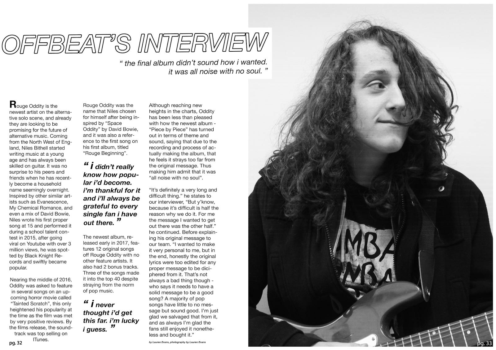
Evaluation Question 7
"What have you learnt about technologies from the process of constructing this product?"
(This was originally in the form of a text document however there is little difference made when I transferred it to here)


From my Pre Lim task, I think I have further improved my knowledge of Photoshop and camera technology, as before we started this project I knew a lot less about cameras and Photo editing software than I do now. I also feel as though I have an improved knowledge on what models to use for the covers and images in my magazines and that I have a further understanding on what exactly makes a cover, double page spread and contents page look good. I have a further understanding of what colours fit certain genres of magazines too. I have further knowledge on how to do certain Photoshop features such as using the Magic Wand and Select tool (although I didn't use this feature, I learned how to do it in case I did).


In my Pre Lim task, I appear to have a lack of understanding on what text fonts and what colours would look effective, the transparency levels on the shapes of red and yellow that I used also make it look to be of poor quality, but I corrected these mistakes when it came to making my main magazine. I also learned more about how text columns are presented, especially in the case of the double page spread. Another thing I learned was how much text usually is required to be on the front of a magazine in order to make it look appealing to readers.


I also improved my knowledge on lighting and Mise-En-Scene from my Pre Lim to making my magazine, as when I made my Pre Lim School Magazine I knew I just had to set the photos in a place that was fairly bright and looked like a place of education; I had to think more deeply about my music magazine as I could have set it anywhere and tried out different lighting and filters for the image.
Friday, 5 May 2017
Evaluation Question 6
"What have you learnt about technologies from the process of constructing this product?"
Answered in the form of a Prezi which is here.
Thursday, 4 May 2017
Wednesday, 3 May 2017
Evaluation Question 4
"Who would be the audience for your media product?"
(I answered this in a word document but just copied it here as there isn't any differences uploading it as a regular blog)

-
This is Mariana Adams, she is 17 years old, and lives in the middle of
Liverpool.
-
She dresses fairly straight forwardly but has her own sort of twist on
it, as she usually wears black or something of a similar nature.
-
She enjoys shopping and going to the cinema with friends, she enjoys night-time
and mainly goes out with friends when it’s evening.
-
She shops at Hot Topic, and likes to shop online on places such as
Amazon, she’s never been a big fan of clothes and clothes shopping, however.
-
She enjoys horror films like Nightmare on Elm Street, the Scream and
Jaw trilogy, she also likes Donnie Darko and Tim Burton movies, but she also
enjoys some superhero and action movies like the Avengers, she mainly streams
the online via services like Netflix.
-
She mainly uses her phone to go online but she also has a computer that
she occasionally plays horror games on, she uses Instagram, Facebook and
Twitter, but mainly uses Instagram and only follows friends. She also uses
Tumblr and mainly reblogs/posts photography and artwork.
-
She enjoys watching TV shows like American Horror Story, Buffy the
Vampire Slayer and Release the Hounds
-
She mainly watches TV shows online or via some service such as Hulu,
and rarely watches TV directly off it, but she mainly watches TV on channels
that show horror films.
-
Mariana mainly listens to music that strays away from the norm, such as
more punk, rock or alternative music, occasionally pop punk however. She’s a
big fan of Black Veil Brides, Three Days Grace, and also enjoys Skillet.
-
The magazine I have created would be enjoyable to this girl as she is a
fan of alternative music and rock music and similar kinds of music.
-
This is Arthur Clark, Arthur lives just outside of Liverpool.
-
Similarly to Mariana, he dresses quite casually but usually in darker
colours, occasionally he’ll wear merch off a band or singer that he enjoys. His
clothing is usually baggy
-
He can play the drums, and wants to be in a popular band when he’s
older, he currently is in a band with his friends and greatly enjoys music.
-
He shops at normal highstreet shops like Primark, but also shops a lot
online as most merchandise cannot be found in highstreet stores.
-
He enjoys horror films but also likes darker animated films or and the
like like Coraline, Monster House, Paranorman or something similar, he also
likes action movies and likes superhero movies such as The Dark Knight,
Guardians of the Galaxy, and Suicide Squad
-
He primarily uses a tablet and phone to go online and records music and
edits it on his PC, he plays games on his PC and is on several social media
sites such as Twitter and Instagram, however he doesn’t use them much except to
follow band members. He does use Tumblr though and occasionally reblogs things
he likes
-
He enjoys TV shows such as Supernatural, Bates Motel and Stranger
Things
-
He also mainly streams TV online and rarely watches the TV directly, he
streams online on services such as Netflix
-
He really enjoys rock, punk, gothic and metal music and enjoys bands
such as The All-American Rejects, All Time Low, and Evanescence.
-
The magazine I have created would be enjoyable to this boy as he
greatly enjoys the type of music it markets.
Tuesday, 2 May 2017
Evaluation Question 3
"What kind of media institution might distribute your media product and why?"
I answered this in the form of a Prezi presentation which can be viewed here.
Sunday, 30 April 2017
Evaluation Question 2
"How does your media product represent particular social groups?"
I used a video to answer Evaluation Q2, making me learn more about film editing tech. I had to upload it on Dailymotion as the uploading process for Blogger is acting faulty. The password to access the file is: Q2
Saturday, 29 April 2017
Evaluation Question 1
"In what ways does your media product use, develop or challenge forms and conventions of real media products?"
We originally worked on question 1 as a group activity and our group was assigned the contents page, however I did my own version of Q1 on my own magazine I created, and it's here.
Finished Contents Page

Finished version of the contents page (with ruler lines for printing purposes)


I drew in conventions from this contents page and Mojo's contents page, however I also decided to use a few differences in order to give the magazine it's own style so it wouldn't look copied.
Friday, 28 April 2017
Finished Double Page Spread

Final draft of Double Page Spread (ruler lines for printing purposes).
Kerrang's Double Page Spread (another alternative music magazine) gave me slight inspiration for this double page spread, the overlapping of the words onto the image, especially. However I did make it rather different at the same time while adapting conventions of Kerrang's Double Page Spread, as I wanted to maintain my magazines house style and put my own spin on it.

Thursday, 27 April 2017
Updating The Double Page Spread
I decided to change the overall heading area of the double page spread in order to make it follow more conventions of a typical music magazine of the genre I have been following.
Saturday, 25 March 2017
DPS Article

Almost the final version of the double page spread, the written article for the double page spread I made for Niles, I've tried to portray him as an alternative artist as best as I could.
Friday, 24 March 2017
Double Page Spread Update


I have decided to change what sort of style I'd prefer for my double page spread, after looking at conventions and style models for punk/alternative magazines I think something similar to this works better - with the title or an attention grabbing quote going over to the other side of the page. I feel like this would work better as it'd look more appealing to readers.
Monday, 20 March 2017
Double Page Spread Photoshoot


These are just some of the images I've taken of my subject for the double page spread, I'd taken many more and tried to experiment with a faceless image idea I had. But ultimately I decided against using this idea.
Contents Page Alteration

This is the more dated version of the contents page now as I have changed the images and used more social media links and also added the title of the magazine. The image is designed this way as most contents pages have more than one image.

The use of more images makes the magazine take more conventions from Q and Kerrang!, although Q is not a magazine with in the genre it's one of the more famous music magazines out there and it's natural to take conventions from it as a style model.
Monday, 13 March 2017
Ruler Lines
I'm going to place ruler lines vertically and horizontally in order to make sure that the magazine images and pages when printed doesn't cut off at the sides, so occasionally when an image of my magazine is uploaded you may see blue ruler lines
Thursday, 23 February 2017
Ideas For Double Page Spread Shoot

I was planning on something like this for the double page spread only except for the two images at the side I decided I wanted to do some sort of photo collage next to the article like this;

Of the photo subject instead of the two images of the boat, I feel like this would fit with the minimalist theme and that if I gave it a Polaroid frame then it'd fit with the alternative style that the magazine has to fit, I was also thinking about putting a glitch filter over the image too. I like the style of text on the second page and I think it could easily fit an easy to read article.
Saturday, 18 February 2017
Contents Page Draft Conventions

The overall style and the way I created the contents page is fairly reminiscent of the Rolling Stone's contents page, with the text centred and the contents in bold at the top, however I also wanted to give my contents page it's own identity so it looks different as well; with the main image going over the top of the text and the lack of colour in the text.

I also used some contents from Q magazine in terms of images but with a b&w theme.
Thursday, 16 February 2017
Contents Page Update
Contents page update, the main colour scheme of the magazine is greyscale black and white so it fits the colour scheme just fine, I also put a glitch effect over the image to stay true to that style I was going for too so it'd match the front cover. The image itself has the subject next to some metal beams for some stairs and some bricks are behind him, so this gives it an industrial effect that is befitting for a punk magazine. I wanted to give it a fairly minimalistic look for a style as well as I feel that would also compliment the double page spread and the cover nicely.
Wednesday, 15 February 2017
Contents Page Draft

I have decided to make the contents page look fairly minimalistic looking, the image looks industrial and suits the mood of the magazine too.
Sunday, 12 February 2017
Cover Page Conventions

The title I used and set out almost looks like something off Kerrang or Rock Sound magazine which are two rock punk magazines, this was done deliberately as I wanted it to give off a minimalist look and yet still suit the genre, the edges of the text of the title also go off the page slightly but this was done deliberately in order to make the title not look too boring. I also decided to put the barcode on the front as well as plenty of magazines put the barcode on front, such as the one above. I also decided to put the date in small under the title in order to make it look more stylish.
Saturday, 11 February 2017
Cover Page Update

Update of final cover page, I used a black and white theme with a subtle glitchy theme as a style, and I tried to make it as minimalist as a punk magazine could be (due to the fact most punk/alternative magazines have lots of text and usually very popping features, but I wanted it to look quite dark and colourless as well as a style). I used a lot of text primarily and quite difficult to spot textures over the picture subject that I thought would fit in terms of who the magazine is aimed towards; it's a punk/goth/rock/alternative magazine so I figured the picture frame texture and the glitches worked in terms of a more odd alternative style. The picture subject on the front cover looks like he fits the mood for the magazine as he gives off a alternative rock vibe, especially with the guitar. Most of the text on the page references real life bands and gives quotes from inside the magazine in order to draw the reader's attention, and the bigger bands we want to use to catch the eye are used in a bigger font in order to get the magazine to sell. I also used alternating fonts and things such as small caps to make certain words stick out more, plenty of magazines such as Kerrang and NME do this in order not to make the text look too dull and to grab the reader's attention better.
Friday, 3 February 2017
Second Draft Of Cover Page

Wednesday, 25 January 2017

Tuesday, 24 January 2017
Magazine Styles
I've decided to go with a black and white theme primarily for the magazine, as this fits in with the overall aesthetic that I think the audience would enjoy, and it gives it a gothic/alternative style over the punk genre it also has, however I decided to also give it a glitchy effect, like TV static, in order to give it it's own unique style and as an attempt to make it stand out more.
Monday, 23 January 2017
Magazine Names
Seeing as how it's a punk/alternative magazine, I wanted a name that would fit it and appeal to the aesthetics of the audience who would buy it, and a name that would stick in people's heads and isn't too lengthy. I looked up some musical related words in a thesaurus and some words relating to an alternative appeal and I found the word "Offbeat", I figured the name would fit as usually punks or people who didn't follow a more conventional taste in music. As the definition of it is "not coinciding with the beat." and the second definition is "unconventional; unusual."
Friday, 20 January 2017
Tuesday, 10 January 2017
Halfway Through Evaluation Question 1 Presentation
Halfway through creating the powerpoint about the contents page. This is not the final outcome and question because this speaks on contents page conventions as a whole, however.


Subscribe to:
Comments (Atom)